Quarantine Buddy
the project.quarantine buddy
noun./ ˈkwôrənˌtēn/ˈbədē
A new mobile application that aids hotels in providing a positive and comfortable mandatory quarantine stay for users by providing personalized, accessible and consistent meals.
duration: fifteen weeks in twenty-twenty-one my role: lead android designer; research; responsive design; wireframing; prototyping; user testing; information architect; user journey context: capstone group project toolbox: pen + paper; figma; material design; zoom; google docs/driveintroduction.As the global pandemic continues to be a constant in our lives, many countries are still finding new ways to help combat the spread. One way is by implementing mandatory quarantine periods for anyone entering their countries. Here in Canada we have since started a three-day quarantine that is completed within sanctioned hotels close to airports.
Our hope is that we can help make this mandatory quarantine experience better by designing a mobile application solution to be utilized by hotels taking part in the quarantine.
“QB is helping to eliminate uncertainty surrounding nutritional needs while staying in mandatory three day hotel quarantine in Canada.”

the problem.
Users at hotels during their mandatory quarantine need consistent, nutritional and accessible meal options, in order to be healthy and to alleviate stress from uncertainty surrounding this most basic need.
research.
market analysis.
Existing mobile + web based hotel solutions are more focused on helping users check-in, are limited to the room, and/or change only their room environment by controlling lights, sounds + smells.
*I did some market analysis here
user research.
By conducting user interviews + utilizing unique research techniques [watching TikTok included!] we were able to determine that users in mandatory quarantine have experienced anxiety and uncertainty in relation to their schedule, meals and overall time in quarantine.
*my team members completed the user specific research
personas.
Based on our connections with international students + with what we saw was as a high percentage of them being those travellers to go through mandatory quarantine - we conducted user interviews which directly led to the creation of the following personas. These are displayed with randomly generated names to protect the privacy of our participants.
*my team members completed the personas + corresponding empathy maps based on their interviews
empathy maps.
research-based feature design.
maslow’s hierarchy of needs.
Through our user interviews + empathy maps, we found that food security is a top concern for those in mandatory quarantine. We confirmed this by utilizing Maslow’s hierarchy of needs - the first level of physiological needs in relation to our app would be ‘food.’ Thus, we focused on providing better food security within our MVP.
*references
covid status bar.
We knew our users would want to know their covid test status as quickly as possible, but at the same time did not want to add to their psychological stress by constantly having a big ‘red’ or ‘yellow’ bar staring at them whenever they came in the app.
Therefore, the user has the option to ‘check’ their status when they feel they are ready.
universal emotions.
Understanding that our users will be from many different cultural backgrounds, having a way to communicate with them efficiently was important. Through research we discovered there are six universal emotions that can be identified through facial expression.
We narrowed down these six to two emotion expressions that would most apply to our application + the situation of our users - happiness and sadness.
*references
information architecture.
Through focusing in on our MVP [thanks to insights from our users + research backed through Maslow’s hierarchy of needs], our information architecture went through a number of iterations. We landed on utilizing a tabbed view navigation structure and placed the highest priority section in the centre - ‘food’ - for easiest access.
It is important to note that we made assumptions based on our initial research in defining ‘food’ as our most important feature. User testing + card sorting activities need to be conducted to confirm this hierarchy in terms of placement within the navigation menu and our current naming convention.
As the app + users demand, this will expand to incorporate further categories and feature offerings. From staying active, to engaging with others in quarantine, to booking virtual appointments with psychologists or nurses - Quarantine Buddy has the potential to be an app that addresses more than just a user’s most basic requirements.
*I was lead on this
feature design confirmation.
mood buttons.
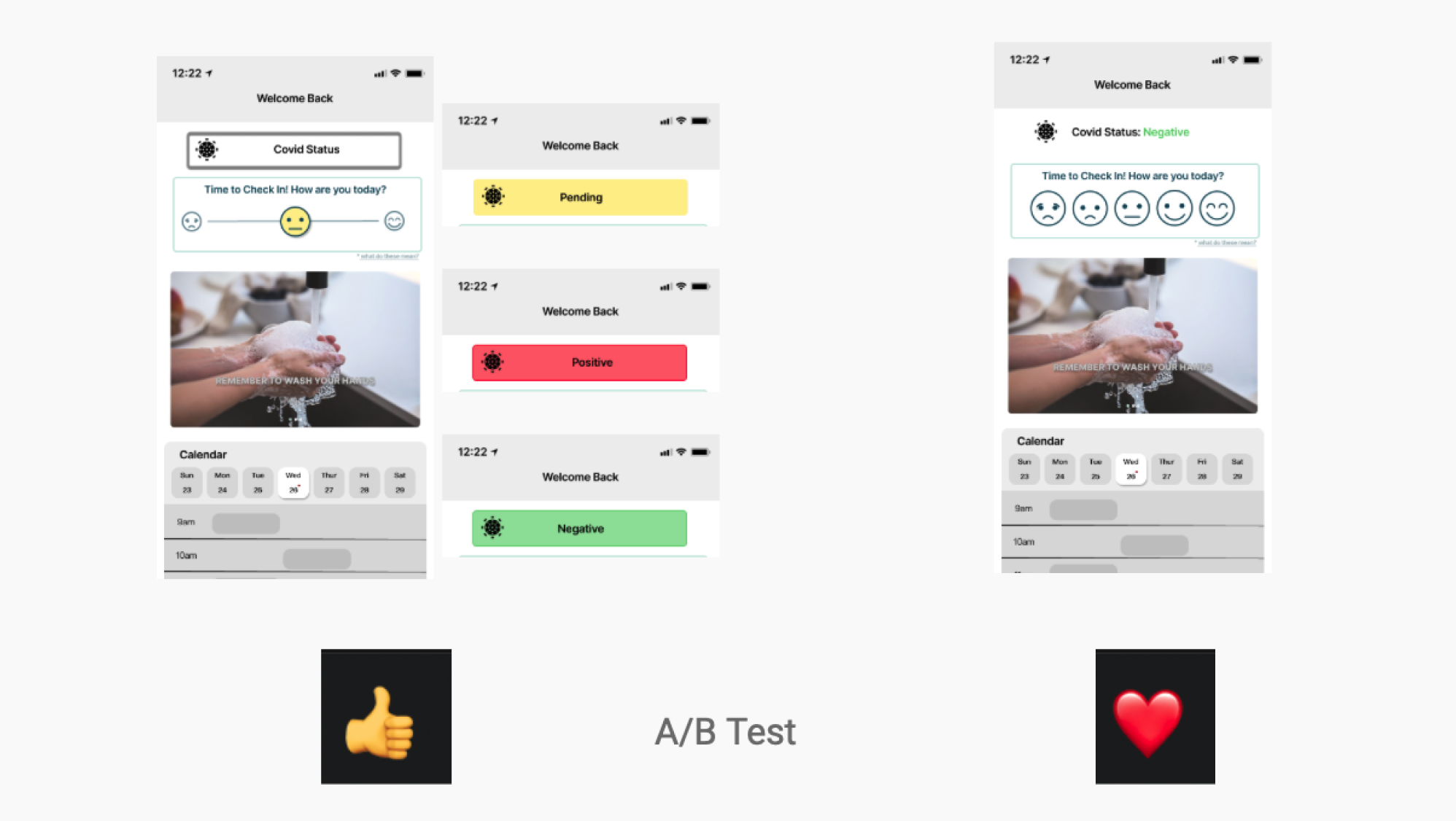
We explored two designs for how the mood button feature would visually look + function. By taking advantage of common Zoom features we conducted an a/b tests during our class critiques. We were able to make design decisions based on facts + research - not just opinion.
covid status.
Here we also narrowed down our potential design for how the user’s covid status would display. Through the a/b test done in class we were able to confirm which design was most appealing to our potential users.
meal plan - ‘days’ tabs.
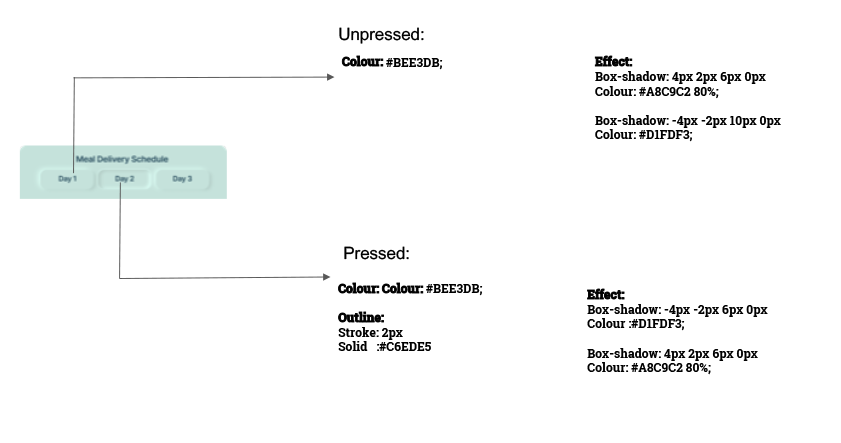
Once again, we utilized what resources we had by conducting one final a/b test in class. Here we wanted to explore + confirm what our potential users thought about the amount of information that should be listed on our ‘days’ tabs. With a clear winner, we went with less information - focusing on individual days vs. dates.
design systems.
moodboard.
We set the tone for what type of establishment would be using this app as a mid-tier hotel. The colours and fonts we chose help communicate this.
Utilizing colour theory, we selected colours that represent such feelings as: fresh; fun; established; trustworthy; dependable; and clean.
*I was lead on this
neumorphic design.
*Dongchen was lead on all neumorphic design elements
calendar.
We wanted to keep the application of the neumorphic design style to specific + unique features/areas within our design.
The calendar was a great opportunity to implore this design style and allows for a consistent feel throughout the application.
dark button design.
We carried the neumorphic design through all of our buttons within the application.
light button design.
This allowed for better continuity and ease of use, as the user could consistently see the neumorphic design on unique buttons throughout the app.
component design.
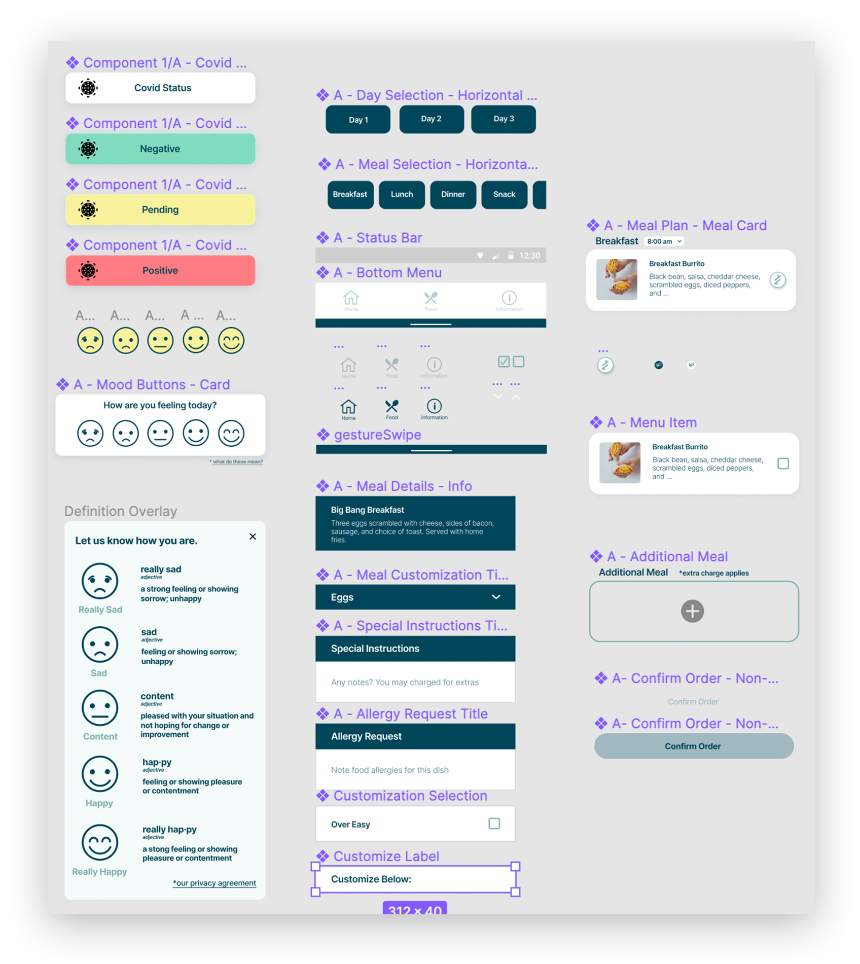
By utilizing key features with Figma, our team was able to consistently design and apply changes based in research findings to our prototype as we advanced within the iterative design process.
Design through colour styles, button styles and even drop shadow styles were created for easy access + mass application.
*Dongchen + I both created similar components for iOS versus Android
mobile app design process.
the final solution coming soon.


