
the project.green.co
noun./ ɡrēn - kō /
A new produce managing app for the home gardener. Whether it is connecting home gardeners with non-profits for donation of un-used produce, or others within the community who could use access to more affordable produce.
duration: six weeks in twenty-twenty my role: ux.ui. designer; researcher; donation flow designer/wireframing/prototyping context: course group project [teammates: Abishek Antony | Dongchen Wu] toolbox: pencil + paper; user interviews; figmaintroduction.As an at home gardener, it can be hard to decide what to do with your extra produce.
We explored how extra produce is currently handled by at home gardeners and how we might assist them in accomplishing this in a more sustainable and mutually beneficial way.
This app will connect home growers with charities, other home gardeners and produce lovers as a way to help reduce waste. It will help build a community and keep things local for all users no matter if they are donating, selling, trading or buying!

the problem.
Home-based gardeners with excess produce need a sustainable way to handle their produce because currently they have limited options on what they can do with it in a more conscious way.
research.

market analysis.
Current gardening mobile applications focus more on advice + community building.
There are also some apps/websites that are looking to help users forage or swap/trade produce, however they are not currently available in Canada or do not have enough users as of yet.
ex. garden tags | crop swap | ripe near me [web]
user research.
From information gathered from user interviews, we discovered that many at home gardeners take part in this activity as a hobby more than out of necessity. They also typically have a small amount of excess that they will usually preserve, give away or freeze. Also, we found out that the amount of ‘excess’ can be unpredictable dependant on environmental factors.
personas.
Based on our user interviews of current at home gardeners, we created three personas for our ideal users + gained valuable insights/confirmations of our assumed problem.


empathy maps.
Providing us with clarity + greater empathy for the deeper problems our users face, these empathy maps allowed us to gain valuable insights + once again confirm some of the assumptions we had going into defining our potential user’s motivations/pain points.


brand design.
moodboard.
Tone: fresh; community; nature; environment; thoughtful; food; togetherness; gardening

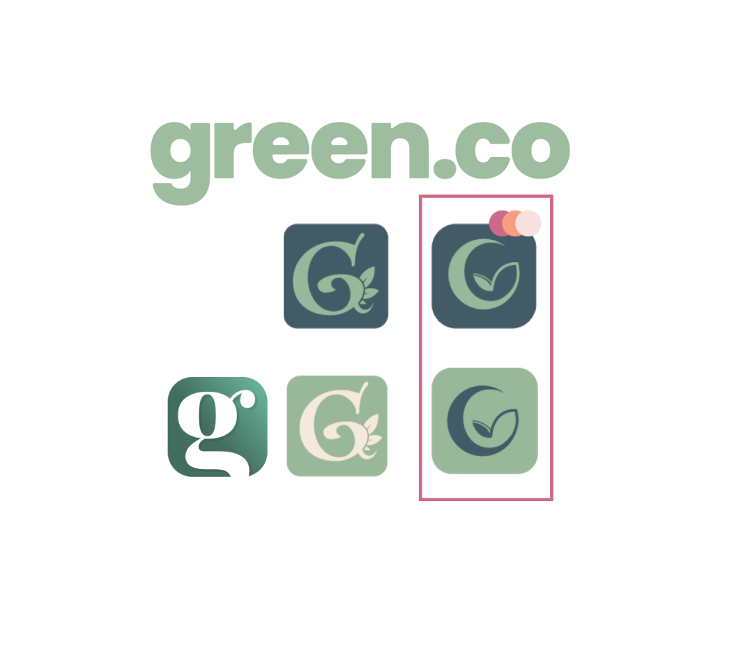
logo/icon package.
Simple, clean and fresh!
green.co’s wordmark logo lets us know the brand doesn’t take itself too seriously. By using a more modern sans-serif font + the branded colours, it remains accessible while reiterating its connection to the planet, environment and community.
The icon was designed with the mobile applications goals and values in mind. The natural shape of the letter ‘G’ helps denote planet earth and by utilizing a leaf design we reference plants/gardening.

app design process.
user flows.
Clearly defining how our users would move through the three key features of our application was important in making sure we had the right solution in mind. It also allowed us to work towards our next stage of design, wireframing.

wireframes.
Within our team I took on exploring key pages within our solution design revolving mainly around the donate flow of which I was very excited about.
ex. landing page; menu selection design; donate flow; my products page

