the project.flowcrux
noun./ ˈflō - ˈkrəks /
A new adventure sport training app that connects you with individualized, technique and skills focused training within the sports of rock climbing and mountain biking.
duration: six weeks in twenty-twenty my role: sole ux.ui.visual designer; website coder context: course project toolbox: pencil + paper; photoshop; illustrator; figma; atomintroduction.As an adventure sport lover, this project started with a personal interest and a problem that myself and friends have struggled with. I wanted to progress within my sport, further than your average athlete, but not at the professional level. I was unable to get skills focused, ‘specific-to-me’ training that would help me improve without having to pay extensive fees for private lessons.
flow. the sweet spot within an activity or sport where you find balance between your cognitive and physical load - everything flows, its blissful.
crux. the key move within a rock climbing route or the most difficult portion of a climb.
the problem.
Young adults who are active adventure sport athletes need a more affordable and easy way to access individualized and local coaching because there is currently no way to access this type of training in an affordable, easily accessible + specific-to-me way.
research.
market analysis.
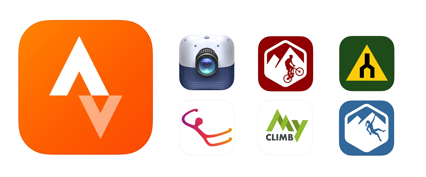
Current mobile fitness applications, related to mountain biking, rock-climbing and training within these sports, are focused on overall fitness, route/trail planning or analytics - not on specific skills or techniques on location.
ex. of apps. strava | coach’s eye | mtb project | trailforks | vertical life | my climb | mountain projectuser research.
From interviews to surveys, I discovered that many athletes were looking for an affordable way to learn more specific skills/techniques at their location within the adventure sports of mountain biking and rock climbing.
personas.
Ultimately, flowcrux is an app that will appeal to a wide array of users and as such I created these personas based on potential primary and secondary users.

brand design.
moodboard.
Illustrated here are some of the final visual design systems for flowcrux. For example: final font selections; colour codes + overall brand tone.
Tone/Keywords: adventure; bold; nature; fun; athletic; healthy; community; training;

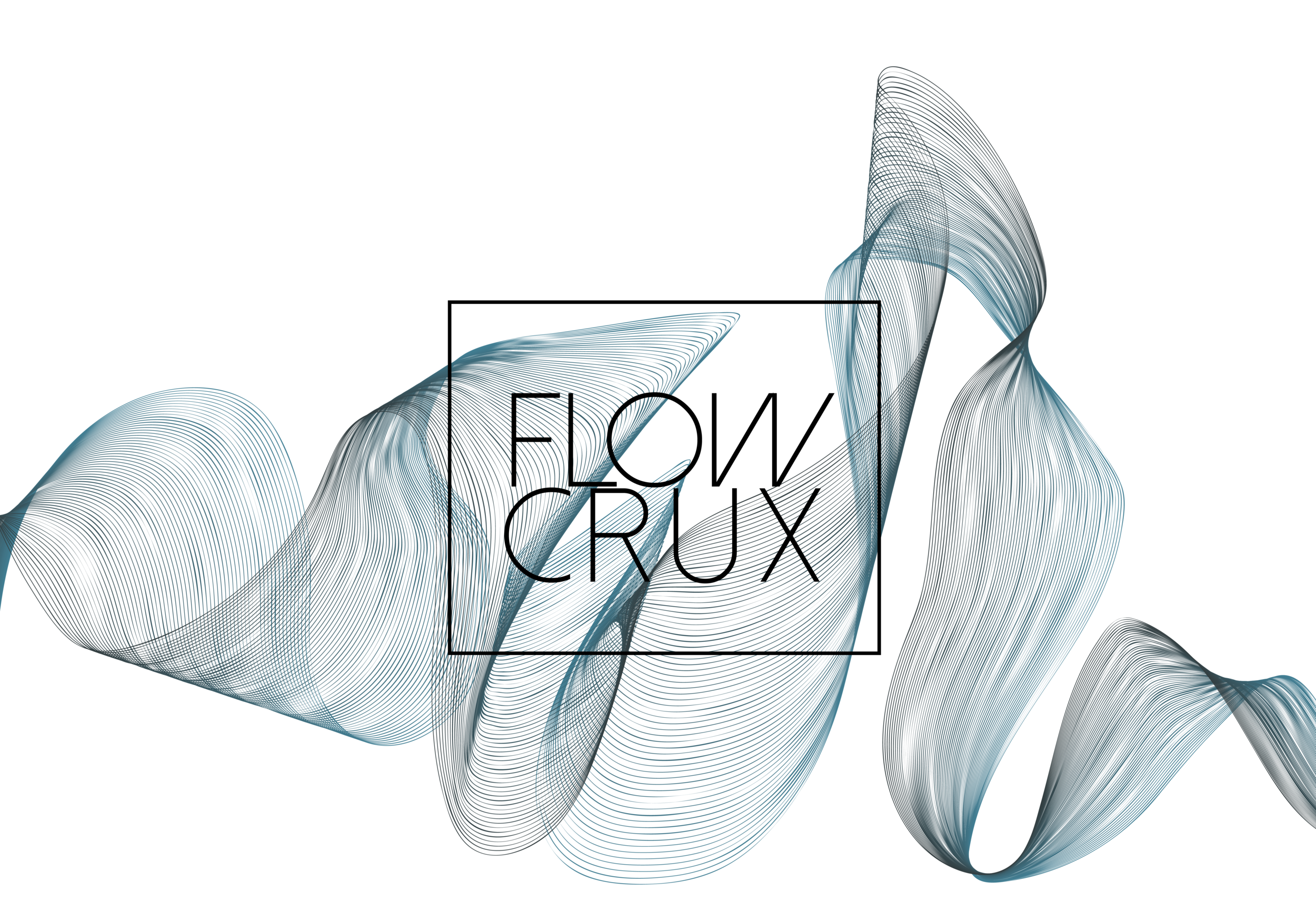
final logo package.
This logo needed to echo/represent the specific sports within which it references - mountain biking + rock climbing.
It illustrates these concepts of ‘flow’ + ‘crux’ through the somewhat abstract mountain or waveform that ultimately becomes the basis for the logo.


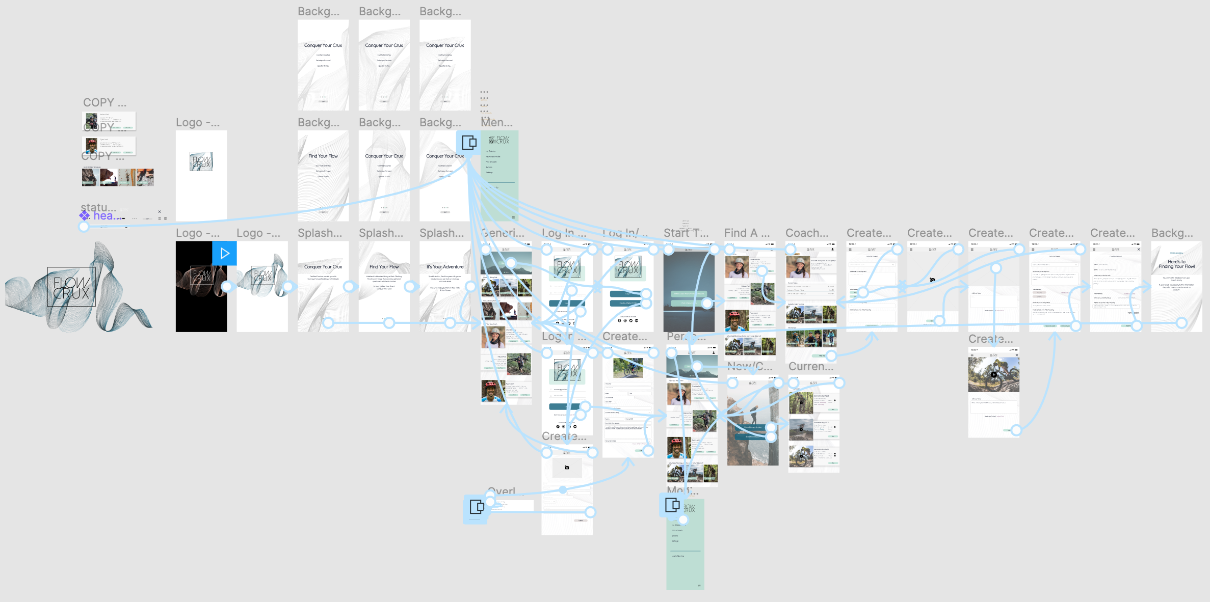
app design process.
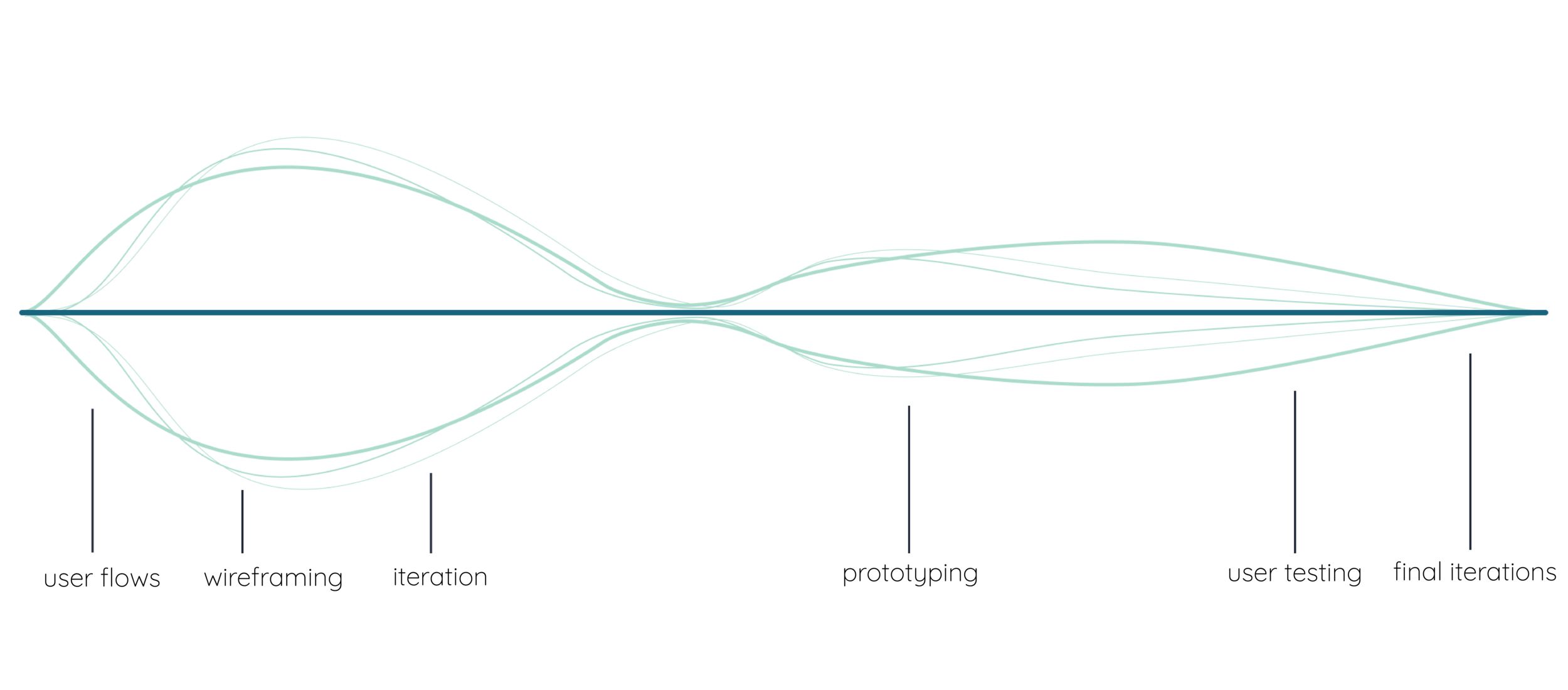
user flows.
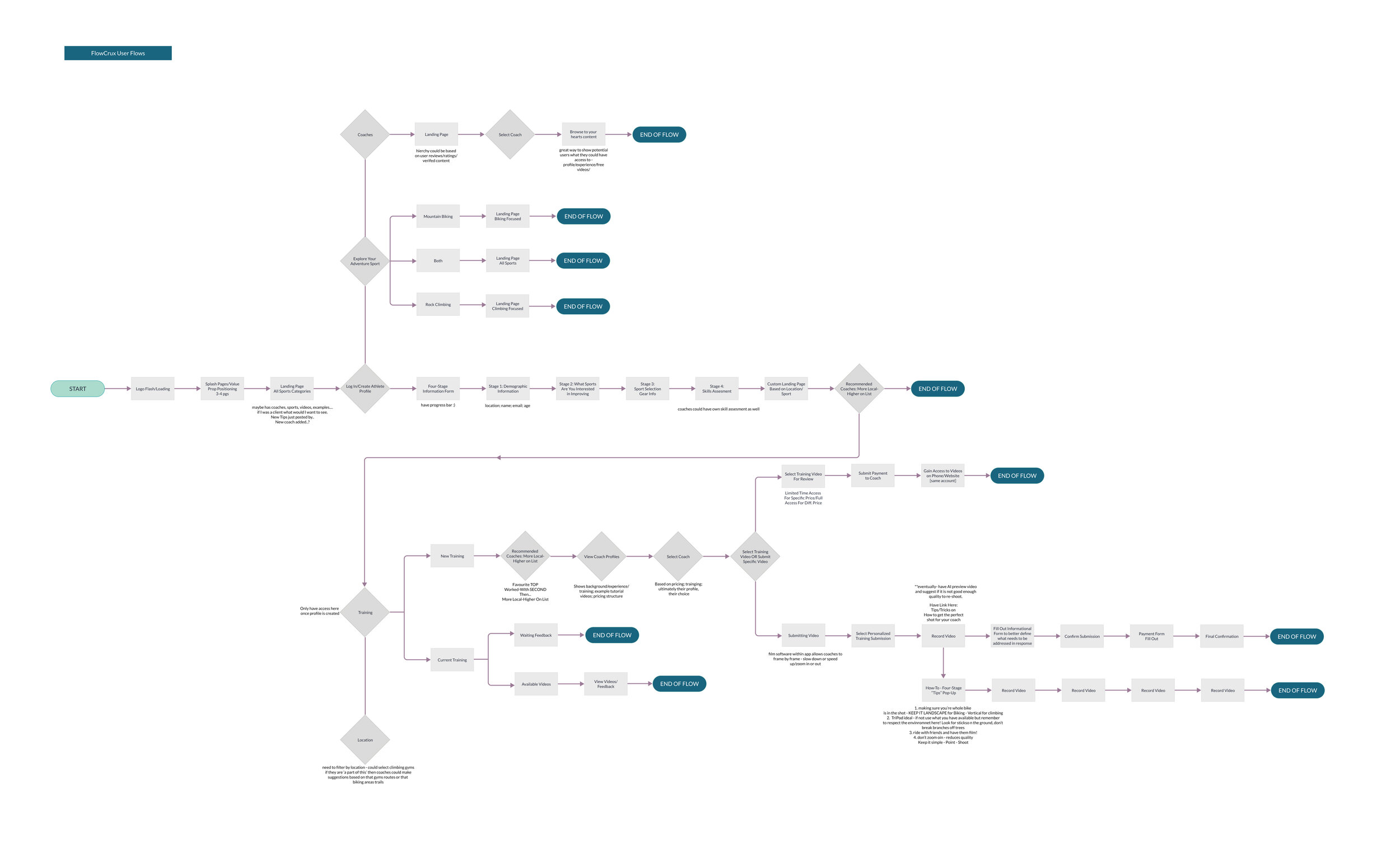
wireframes.
Starting to flush out multiple ideas quickly, without too much focus on content was an important step in the design of this application. This allowed me to iterate quickly on layouts and the overall feel of the application. Here I focused on concepts for the main pages as defined in the above user flows.
ex. splash pages; landing page; athlete profiles; new training requests; coaching responses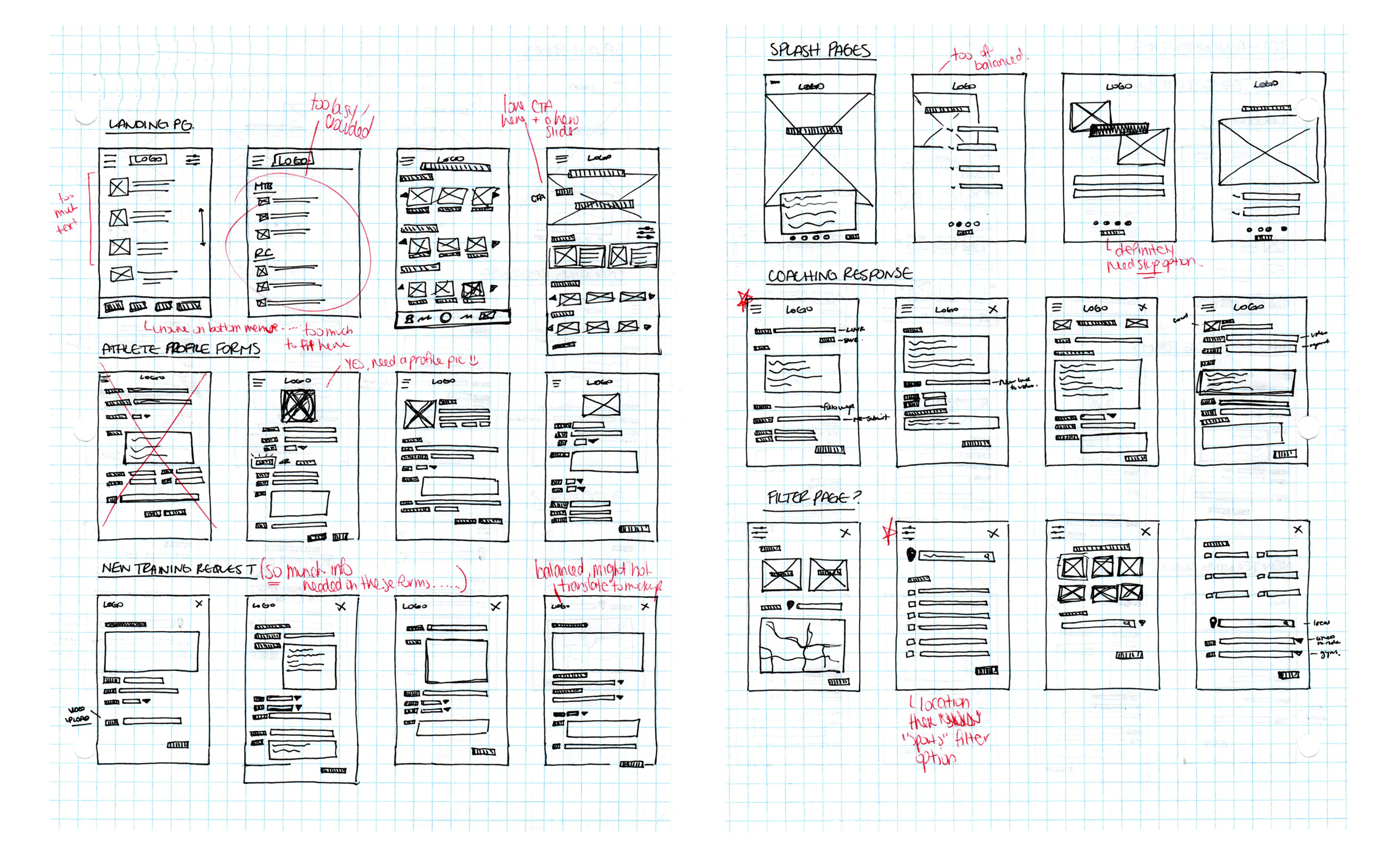
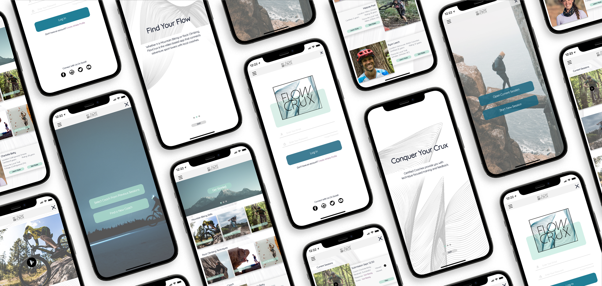
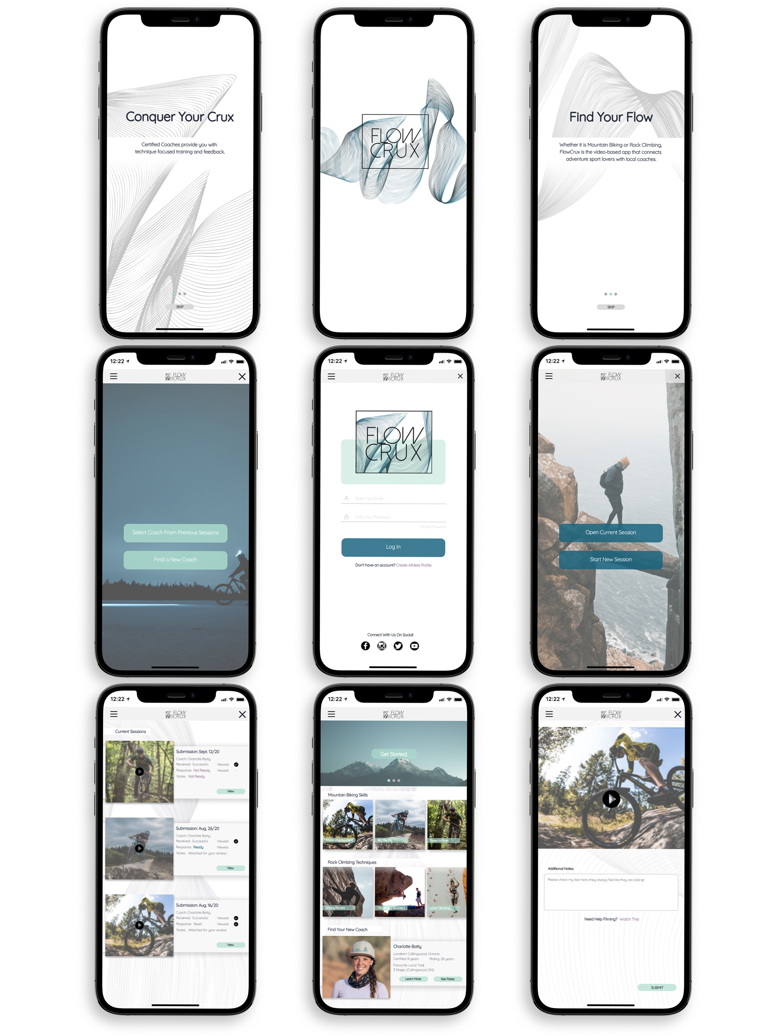
mockups.
This is where I was really able to hone in on the feel of the application, the type of interactions that would be ideal for users and ultimately how we can bridge that gap between functionality and aesthetics.
Maintaining our brand’s tone of adventure; bold; nature; fun; athletic; healthy; community; training; etc., I utilized the established colour palette and font options to really drive home the branding.
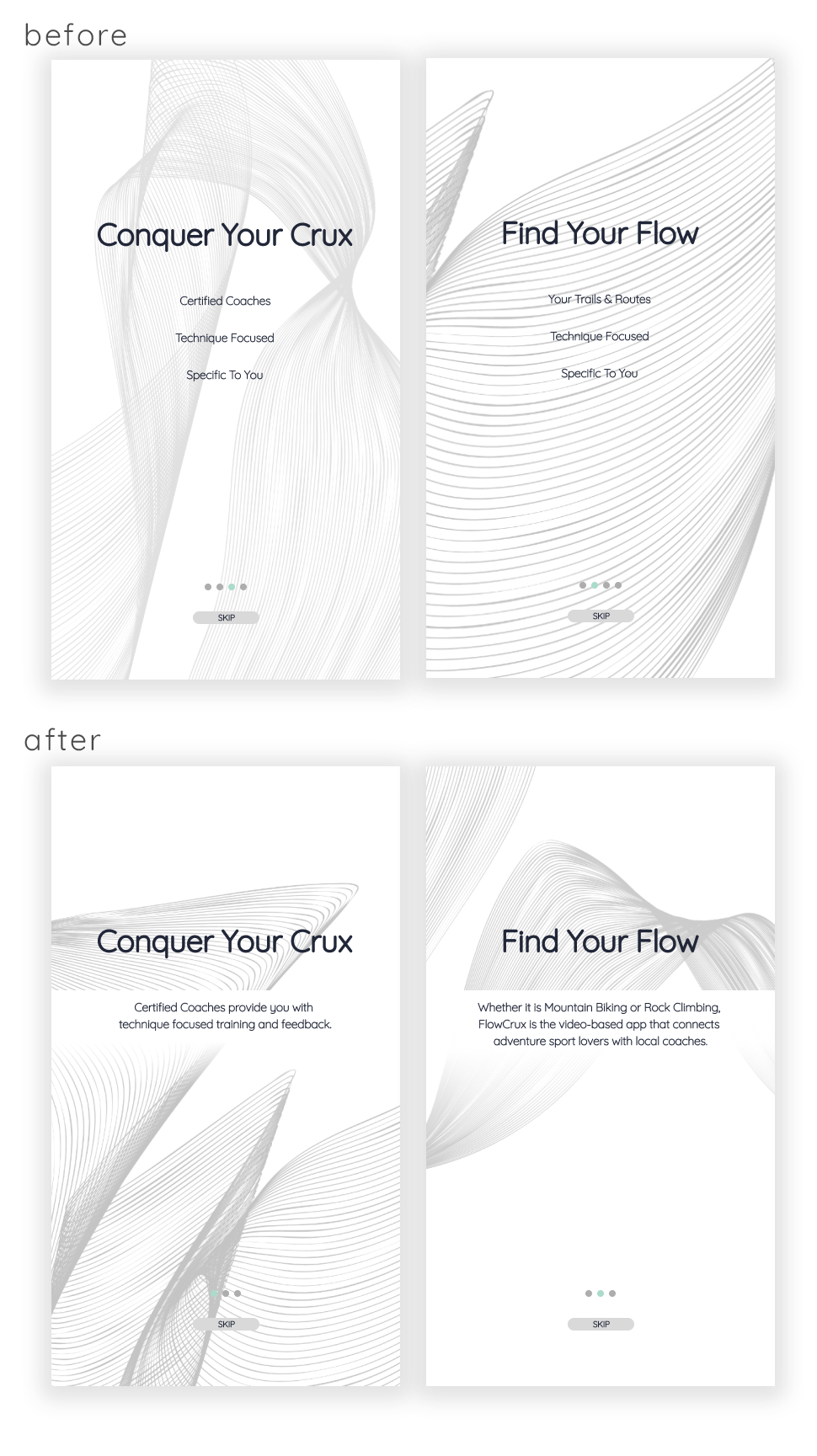
user feedback.
Conducting preliminary user testing was important to gain insight into how the app was progressing thus far. How well did the application solve our users problems? Were there issues within the application itself that needed to be addressed?
Overall, I was able to gain some excellent insight into the functionality of the design and aesthetics itself and applied those research results to the ‘final’ design.
hard to read text.
Specifically looking at the splash pages, utilizing the waveform from the logo/brand as a backdrop made the text overtop hard to read. going back in + creating depth with a bar overlay helped define the text as separate from the background design.
deadspace.
The hamburger menu was leaving something to be desired with the amount of deadspace that was on the right side and bottom. making it slightly more thin + adjusting text placement helped fix this issue.

prototype.
Check out the high-fidelity clickable prototype through the link below.
intro to flow crux.
Utilizing splash pages, the user gets a clear understanding of the main value propositions this new mobile application is offering.
login for exclusive content.
With an account users are able to access free content from registered coaches + purchase sessions.
record for feedback.
Record the feature or skill you are having trouble with - Submit for feedback from selected coach - Practice. Practice. Practice.
marketing website.
Using html + css I created a brief marketing website for this new mobile application.
full list of references coming soon!